


Curriculum Associates, LLC
CREATIVE LEADERSHIP / BRANDING / IDENTITY / CHANGE & PROCESS MANAGEMENT
I joined Curriculum Associates—makers of the popular i-Ready Assessment and learning software—in November of 2022 in a new role as Director of Brand. After acquiring an AI voice enablement company, there was a need to position CA as a leading Edtech company rather than the print publishing company of its past. There was an urgency to elevate all marketing materials as well as create more efficient workflows in order to establish CA as a leader in K–12 education.
Existing Brand Materials
While the i-Ready product had a style guide, the instructions within were complex and hard to keep consistent across a larger team. This combined with projects becoming immediate needs meant less time was spent on QC. Overall the marketing brand was outdated and aimed to please end users rather than our target audience who interact with it most.

Repositioning the Flagship Brand
Alongside the Director of Content and a contracted brand consultant, we took on the task of evolving the i-Ready brand to the next level and moving from a house of brands to a branded house. This would help signify to the market that i-Ready is not just assessment software, but an entire product suite.
Over the next 9 months we conducted user testing with feedback loops, worked on core messaging, and concepted a bold new way forward—entirely in-house. Next steps included creating a brand hierarchy system (including an endorsement strategy), organizing curated photo shoots, a complete website overhaul, creating cohesive sub-brand product “themes”, and a revitalization of our highest equity icon—the i-Ready cube.
Taking apart the well-known cube to create something new and exciting wasn’t an easy sell, but the brand equity from having 15 million student users was obvious. So we fleshed out an entire system of deliverables to showcase the potential of going bold in a historically safe educational market. The direction embraces tech while retaining the equity of the existing i-Ready brand, and brings all product brands together in a cohesive, flexible, and ownable system— complete with branded color palettes, graphic bars, patterns, images, typography, illustrations, and templates.
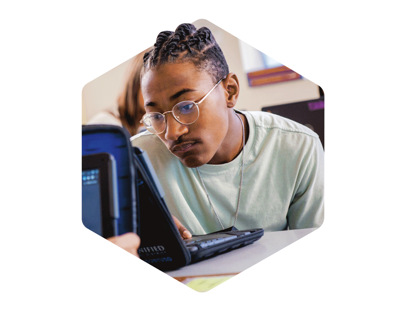
The i-Ready cube is the core of the graphic assets and treatment. We found that when we the overlapped the cube’s side shapes, new colors and geometric shapes were created. We used the solid hexagon—also based on the cube proportions and soft corners—as a window to place images of students, teachers, devices, and illustrations from the product.

Digital Overhaul
The rebranding effort also required a website and social media overhaul to focus on the user experience and alignment of the brand voice. We built the system around structured content for better navigation and usability with accessibility as a priority. We designed Sitecore modules (with a headless CMS) to work together and apart—all within the branding “themes” so that products could simultaneously be individuals but also a part of the larger i-Ready family.
Event Design
Since industry conferences are a major touchpoint for our audience, we also redesigned our in-person booths and materials to create a more cohesive and interactive experience.
Creative Leadership
In addition to bringing expertise to technical and strategic projects, it was necessary to also guide the team through multiple rounds of org, leadership, and process changes. As a fully remote team, I organized multiple in-person meetups to foster relationships, opportunities for designers to increase skillsets and practice leadership, and increased trust with transparency, allowing voices to be heard, and taking meaningful action on issues. This resulted in a 15% increase of employee satisfaction over the past 12 months and 100% retainment.
Other Notables:
Curation and design of the BrandED Newsletter—to communicate out brand updates, examples, and resources, including updates on major brand initiatives like positioning and naming exercises
For the first time, changing processes so that the Marketing team collaborates with the Product team up front on new products and features, increasing quality and consistency with art direction and planning up front, rather than reactively
Helped bring online an office hub in India to aid with creative production, including hiring creatives and streamlining workflow to increase efficiency
Enacted monotony-breakers for design staff which includes quarterly design challenges
i-Ready is a connected learning experience.
One that not only connects students to an assessment, but also to a wide range of educational tools across print and digital; math and reading; and professional development.
We set out to change the perception of i-Ready: from a single product to that of a robust portfolio. Not only that, but how the connection of tools—including AI—can help classrooms become better places for students and teachers. To do this we needed to rethink how we expressed the brand as a whole.

We started at the portfolio-level.
At the core of our identity is the i-Ready cube—a recognizable element within the education space that holds a great deal of brand equity. We took the cube and broke it apart to envision it in new ways to allow both flexibility and cohesion.
The pattern was used to create breakaway ‘tessellations’—a nod to digital pixels and the connection of products to the digital assessment.


In thinking about the aesthetic as a “system,” we assigned a limited color palette to each of the product sub-brands. This helps visually connect back to the portfolio-level.
We were able to pull out a singuar shape—a simple triangle—and use it to create both a bold pattern and a subtle grey grid used for the alignment of elements.

Cleaning House
Icons were redesigned to be more modern and accessible. Tables and charts were simplified and streamlined.
Getting Creative with Equity
The main photo treatment is a hexagonal container, and—as with everything in the system—is derived from the familiar i-Ready cube.


Reuniting with Old Friends
The product team had been using the Gilroy typeface for several years, and the i-Ready logo itself is based off of it (as well as elements of Montserrat). The family is more modern than our existing Jubilat but still approachable, so we decided to incorporate it more fully into marketing materials.
The re-adopted typeface and newly created graphic devices are applied similarly across all products, creating cohesion while allowing the individual sub brands to have their own identity.


Bringing Assets to Life
We invested in adding motion where it counts—social, paid media, and advertising—where we need to stand out rather than fit in with static images. Our playful, vibrant product illustrations are the perfect candidate for motion, allowing us to breathe life into campaigns.

Enhancing the User Experience
The former website (left) was outdated, wordy, and had a disjointed user experience when it came to separating i-Ready from our parent corporate entity. The new experience (right) is distinctly divided in two—most notably in the navigation—focusing on the main audiences for each. The sub-brand design system allows continuity throughout the site while giving space for individual brands to shine.